In everyday work with code, it is important not to waste time on operational matters. However, how not to get lost in your and other people’s reports and contributions? How do you know what to look at? How not to miss anything? Both GitHub and Gitlab have their own activity monitoring mechanisms - let’s take a look at them!
Context
First, let’s outline the perspective from which I will present both of these systems.
I have been dealing with Gitlab on a daily basis for many years, because the companies I have worked with and currently work with, chose this platform for code storage, code review and automation of CI/CD processes (an important argument for such a decision is the fact that Gitlab can be run as an On Premise instance in your own infrastructure, without releasing the code outside the company network).
GitHub, in turn, is a kind of standard in the Open Source world, so it can be safely said that using it is inevitable in a sense - whether in the form of issue submissions in used projects or in the form of contributions. I also keep my own OSS projects on GitHub, mainly to learn about its capabilities from the maintainer side.
These circumstances mean that I use Gitlab much more than GitHub, but at the same time it does not mean that I would clearly indicate one of these platforms as better - they are simply different, although they have many similarities.
Stay informed
What I would like to focus on in this article are the techniques of observing and reacting to activity in the system, mainly in the context of merge/pull requests (but not only). We can distinguish 2 basic needs:
- access to the list of all tasks or merge/pull requests that we are watching (whether as an author, reviewer or just following what’s happening)
- access to activities within these (other people’s comments, code changes, state changes)
We need the list to be able to find the task or merge request we are interested in at any time, deciding what we are looking for at the moment. We may need to add some comment that sheds new light on the matter, or want to share the link with others. At such a time, we want to be able to search for things we are interested in using various criteria.
In turn, wanting to be up-to-date with what is happening in the notifications or MRs we observe, we would like to have access to the chronological stream of events in the areas we observe.
While the first need is fulfilled by both platforms, the second one was addressed only by GitHub with its notification system. Personally, I really like this view, and it makes it much easier for me to keep track of what’s going on. In the case of Gitlab, I have to use the meager equivalent of email notifications…
Working with GitHub
Watched areas
GitHub gives us many predefined views to track the areas we are watching, two of which are available in the main top menu:
- Pull Requests created by us
- Issues created by us
These two views offer both the ability to navigate to other predefined views and to change the default search criteria (by default, open PRs/issues in all organisations are displayed).
My Pull Requests
Let’s look at Pull Requests’ list and what it offers:
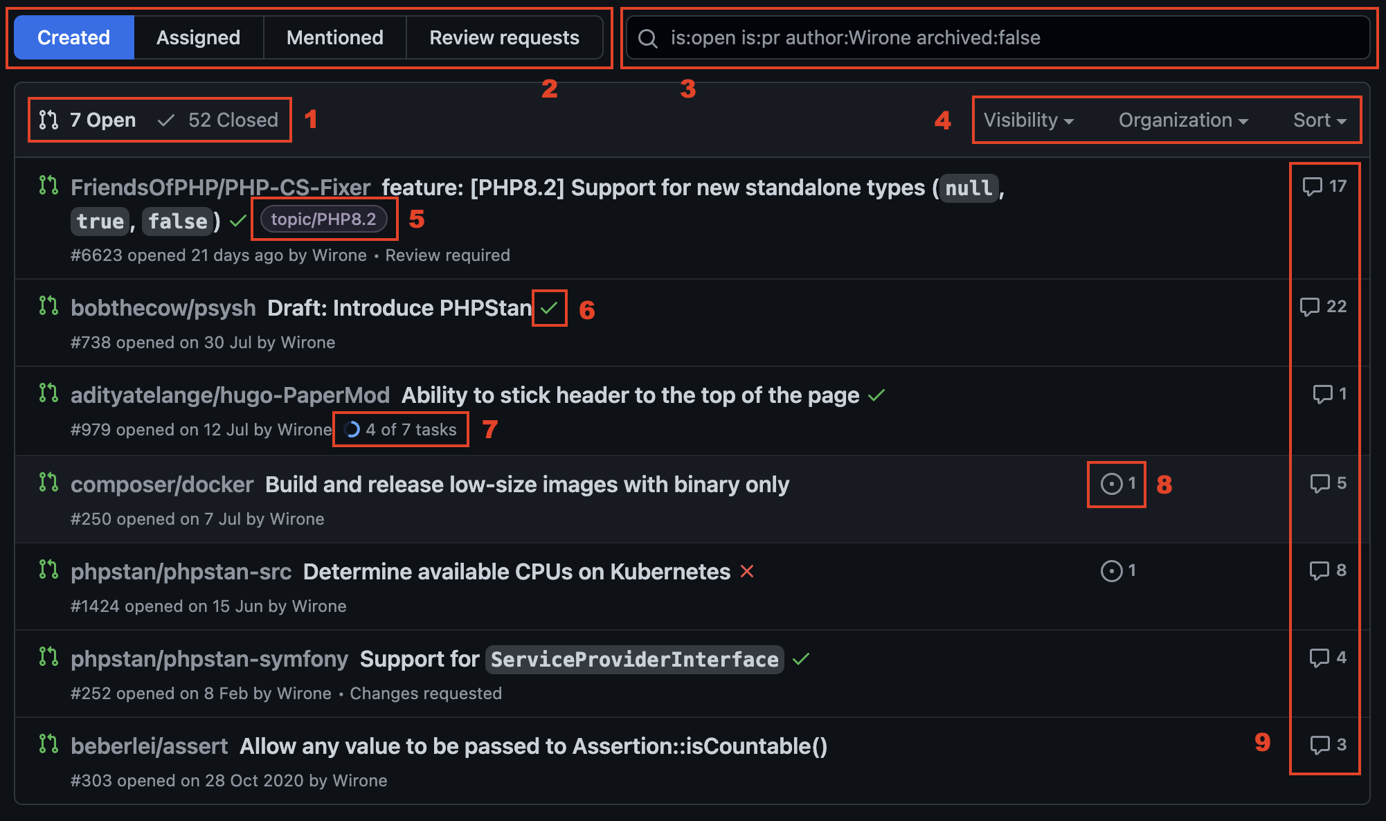
- Context switcher: opened and closed PRs
- Predefined views of PRs: created by me (domyślny); assigned to me; mentioning me; with review request
- Advanced search offering a lot of filters
- Helpful filters and view settings
- Labels added to PR
- Result of last Actions
- Checklist progress within PR (state of work)
- Related issues
- Comments’ count
My Issues
Very similar functionalities and a set of presented information can be found in the issues view:
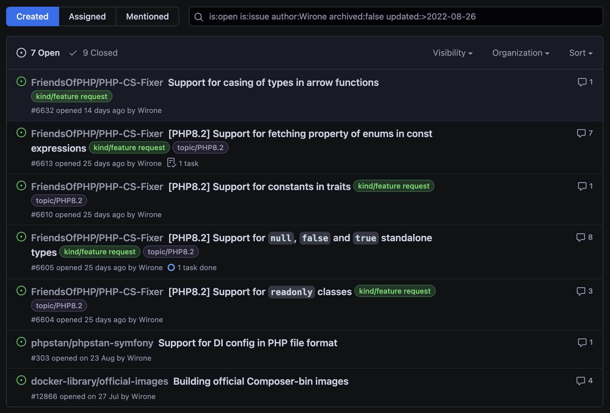
All these elements are helpful in the context of searching for the content we are interested in, and it is hard to find a scenario where finding specific things would be impossible. There are also helpful hints displayed below the list, which contain random information about the available filters and how to use them.
Search engine
Nevertheless, a spoonful of tar went into this barrel of honey. The GitHub search engine has one, but a big drawback: does not offer suggestions. The result is that we have to learn filters by heart, or use documentation.
Fortunately, there are unofficial solutions to this problem, namely user scripts like this. They make it much easier to use the search engine, suggesting which filters can be used and what values these filters take (in the case of dictionary values).
Notification View
As I mentioned earlier, GitHub offers a notification view that I really like. Let’s take a look at it:
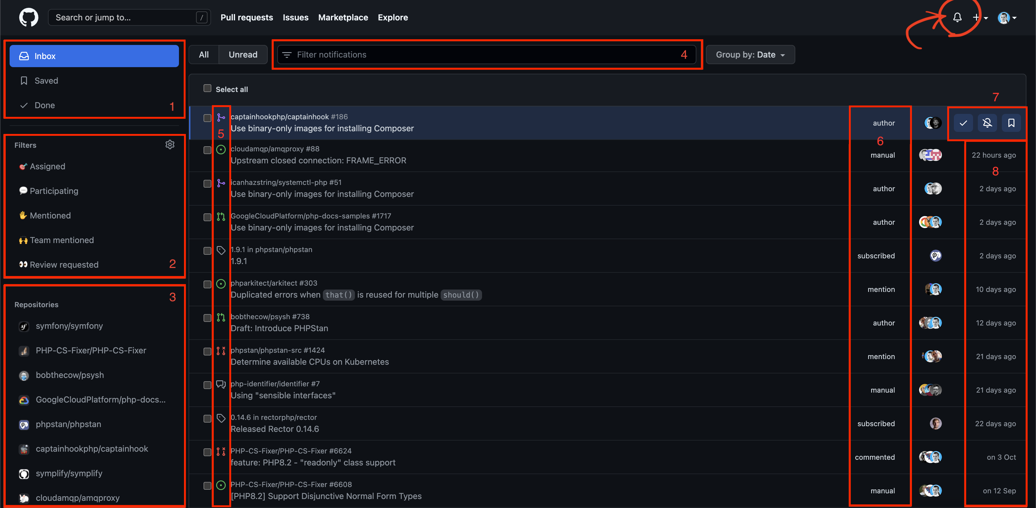
- Contexts:
- Inbox: there we can find all new notifications. I also use it to keep a list of things I want to keep up with
- Saved: items saved for later (see point 7)
- Done: items marked as done
- Quick filters to limit the displayed notifications by type of activity
- Assigned to me
- I participate in any way (following, commenting, etc.)
- I’ve been mentioned
- A team I’m a member of has been mentioned
- I was asked for a code review
- List of repositories from which notifications come, thanks to this we can quickly limit the results to single repos
- Filter to restrict notifications by criteria. Interestingly, in this view you can use autocomplete 🤷 ♂️
- The type of item to which the notification relates. Thanks to this, you can clearly see whether the notification concerns an issue, Pull Request, discussion or a new version released in the watched project. More: You can even see whether a ticket or PR is open or closed.
- Subscription method: shows us whether we are the authors or, for example, commented in the past
- Contextual controls: after moving the mouse cursor over the selected element, action buttons are shown:
- mark as done
- unsubscribe
- save for later
- Last activity time
As you can see, we have a lot of valuable information here and many ways to search for what we need. I use this view on a regular basis, reacting to new notifications and taking appropriate actions. When I can’t do something right away, I leave it in my Inbox and come back to it when I have free time. Thanks to this, the notification view serves me at the same time as To Do list.
GitHub in practice
I’ve started using GitHub a bit more recently as I’ve contributed to various Open Source projects. It wasn’t a large-scale use of course - there are plenty of people who maintain/support many more repositories and have to track a huge amount of activity, so my perspective may not be entirely objective and authoritative. However, it can still be useful 😉
In the case of GitHub, I treat e-mail notifications only as an additional channel that in some situations can speed up my reaction - after all, I have my phone with me almost all the time, so there is a much better chance that I will notice this type of notification faster than in the GitHub UI (especially in the afternoon and evening). In this case, when I take action after receiving an e-mail, I immediately mark such an item as completed in the notification view.
I aim for “0 Inbox”, which is an empty inbox in the notification view. Of course, this is not a rigid rule, because sometimes I consciously leave there elements with which I have already become acquainted (and even reacted) in order to be able to easily come back to them later. On the other hand, if I would like to be able to find elements that I consider important, but which have already been completed (e.g. merged PR), I mark them as saved.
I believe that the key to good organisation in the context of activity tracking is dispatching as soon as possible - you can’t afford too many notifications, because then it becomes more and more difficult to work with them, which can lead to “callousness” and complete cessation of using this view. If it comes to a situation where there are more notifications than we can handle, you should consider changing the notification settings in individual projects - perhaps some are not so important, and they don’t need to flood your inbox.
Of course, you can also create some internal arrangements in organisations/projects and divide the work between many people. Of course, there is also the possibility of automation using bots, but that’s a completely different story 😉
Working with Gitlab
Watched areas
In Gitlab, the top menu provides us three buttons that direct us to dedicated views:
- Tasks to which we are assigned
- Merge Requests (drop-down menu):
- assigned to us
- in which we were asked for a code review
- To-Do list
In the following, I will present the view of tasks and Merge Requests in contexts other than those linked in the top menu. Firstly, because I can’t use screenshots from company Gitlab instances here, and secondly, because in publicly available Gitlab, I have blanks in these views because I’m not assigned anywhere 😉. However, the information displayed on these views will be exactly the same, the only difference being the selected filter.
My issues
Let’s take a look at the issue list in Gitlab:
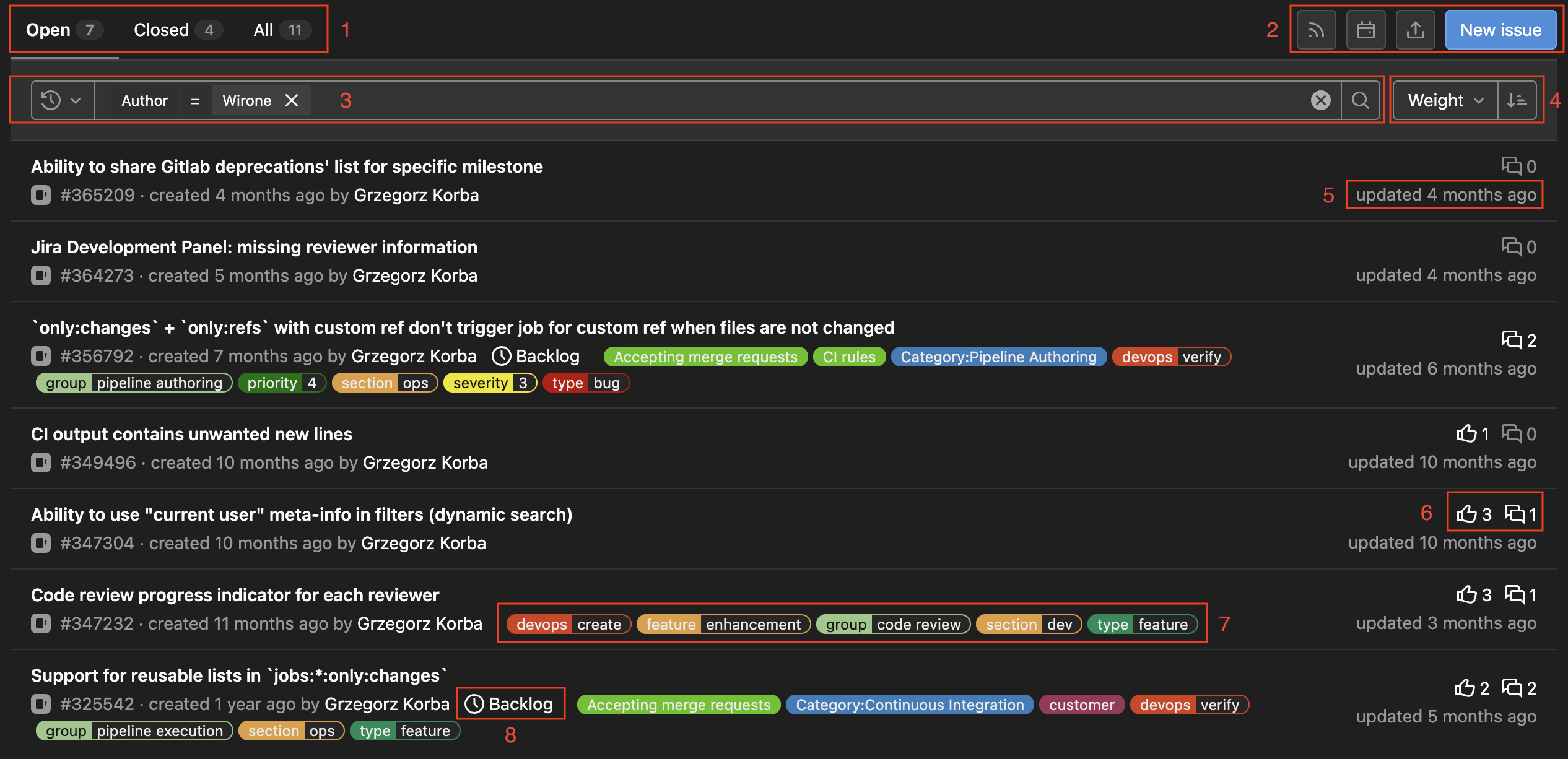
- Contexts: open, closed, all
- Various types of minor controls: RSS feed, calendar subscription, import/export, create a new issue
- Search engine (filters)
- Choose how to sort the results
- Last modification date
- Reaction and comment counters
- Labels
- Milestone to which the task is assigned
The view is neat, but it gets heavy with lots of labels (just take a look at Gitlab’s issue tracker).
My merge requests
The view of merge requests is very similar, it differs in details:

There are slightly different contexts, slightly fewer controls, and in each item on the list we also have:
- MR’s status (visible only in the context of All)
- Status of the last pipeline
- Assignees and reviewers
- If Approval Rules is used, we also have information about whether the MR has been approved
Review Requests
The review requests view is basically no different from other views with the Merge Requests list, it is simply that the search criteria is set so that we can see where our code review (and possibly approval) is required. This view has one major flaw - it’s absolutely useless.
The reason is simple: in Gitlab there is no concept of “expected changes”, i.e. when we finish the code review, and we do not approve, but left comments, we would like such MR to be removed from our list until changes are made and there’s review request again. Currently, when we are reviewers, we see this MR all the time in the list, which makes it very difficult to control where our action is required if there are many MRs.
Some time ago Gitlab was working on the concept of “Merge Requests requiring my attention” which looked promising for tracking activity in MRs. Unfortunately, the idea was abandoned and work focused on the concept of “review rounds”. I tried to actively participate in both topics, presenting the user’s perspective (here, here, here, here, here and various other places).
Unfortunately, in this context, GitHub has better support for tracking places that require our action. I hope that three-state reviews will be introduced in Gitlab (accepted, expected changes, rejected), which will enable more convenient work with the tool.
To-Do list
The To-Do view groups the actions we should take. The data presented in it is very readable:
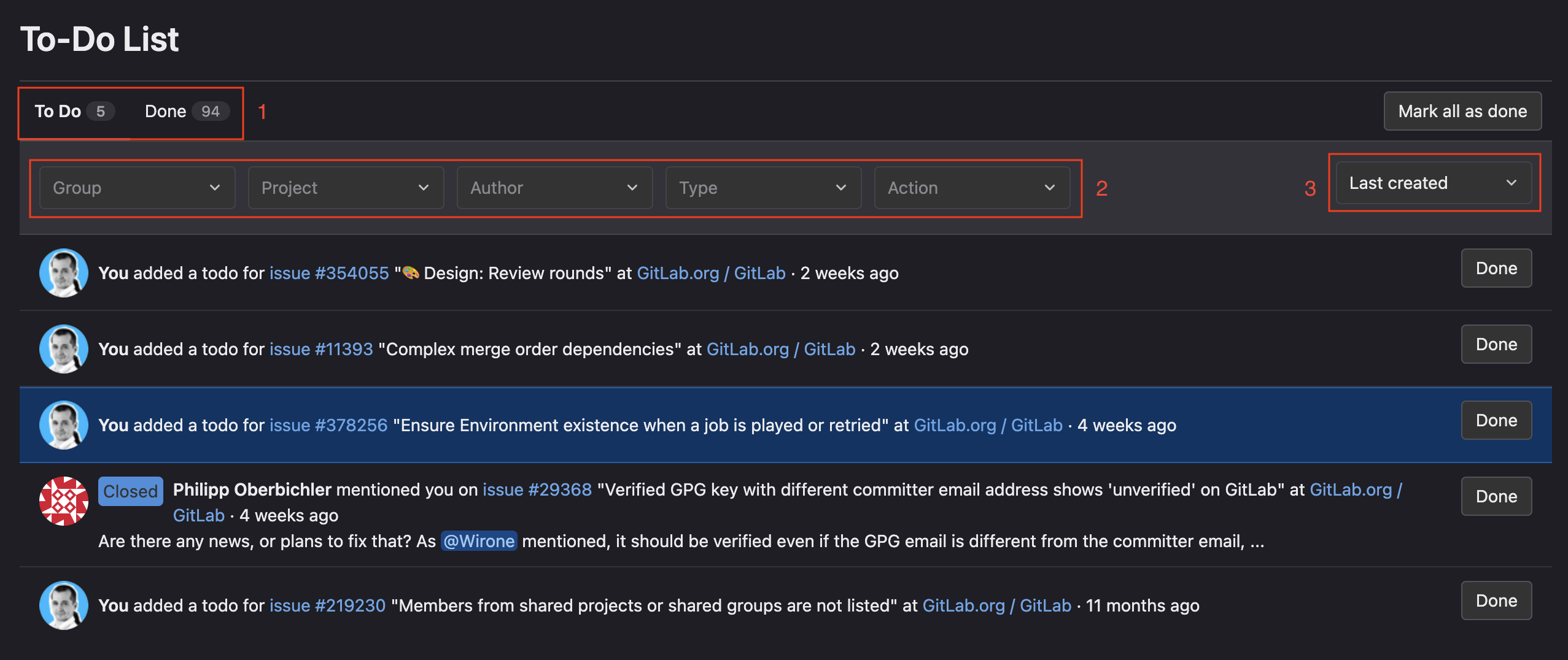
- Contexts: to do, done
- Filters to narrow down the criteria
- Sorting type
I must admit that I rarely visit the To-Do view. This is because the information in it is not helpful to me, or the other views just provide what I need.
Items appear in the list at different times: when we are added as reviewers, when someone @mentions us in a comment, etc. However, it seems to happen in a chaotic way - for example, when I add myself as a reviewer in MR, the item appears in the To-Do list, but in the context of Done 🙄. And even when elements appear in the correct To Do context, they disappear from it automatically after performing an action (e.g. commenting on MR, which does not mean that the review is finished).
As you can see in the picture above, however, I found some use for this view - I add there elements that I observe and to which I want to have quick access. To do this, I click “Add a to do” in the right-side menu in the issue/MR view.
I’ve been using Gitlab for many years, and yet to this day I haven’t been able to squeeze more out of this view. Maybe I should give it some attention, and maybe it can help me more? I would love to hear your opinions and advice 🙂
Search engine
The search engine in Gitlab is pleasant to use because it suggests possible filters, operators (types of comparisons) and values. Visually it looks good and is helpful when using search, but unfortunately there are a few things that I can complain about:
- filters are few, especially when compared to the multitude of filters supported by GitHub
- if we choose the wrong value from the list, deleting it is inconvenient: using backspace, we can delete it (but not in one go, only as edited text), while the ❌ button deletes the value along with the operator and filter
- It is not possible to create a universal filter based on the currently logged-in user, which makes it impossible to easily share links to views with pre-filled search criteria. I have submitted such a request, but it is unlikely to be implemented in the near future…
Notifications… by email
Gitlab does not have a built-in notification view, so unfortunately tracking activity in watched tasks and merge requests is very difficult. The previously described views don’t make it any easier. Although sorting by last modified date may help a little in finding things to review, nevertheless you have to rely heavily on your memory or routinely check everything every day to not have to wonder what has already been checked and what hasn’t.
Personally, I have developed a process based on e-mail notifications. It is very similar to how I work with the notification view in GitHub, only I do it in the email client. And this is the basic disadvantage of this solution - it requires jumps between tools. My process looks like this:
- all notifications from Gitlab are enabled and I have email rule, so all notifications go to a dedicated folder
- unread mail = notification to get familiar with or to come back to it later
- mail read = activity verified, but still waiting for action on the other side (e.g. corrections after my review)
- e-mail deleted = notification does not require my reaction
The goal is to keep an empty “Gitlab” folder in the mailbox, so emails are deleted on a regular basis - either when they do not require my reaction, or when I perform such a reaction. This also fits well with a smooth code review process, as fast processing of notifications helps with quick code integration. The sooner I take the action resulting from the notification, the sooner I will unblock the person “on the other side of the process” 🙂.
I only leave e-mails in the inbox that I want to come back to (e.g. when I see that MR has received new commits and another code review iteration needs to be performed). If something is important and I want to come back to it sooner, I leave a message marked as unread. This approach, combined with the views of MRs (where I am an author or reviewer) allows me to stay up-to-date with what I am responsible for.
However, this does not mean that the process is convenient and optimal… It is rather a workaround, not a solution 🤷.
Gitlab in practice
As you can see above, my way of working with Gitlab is a mix of using predefined views with the so-called email-driven approach. This may not be the optimal use of Gitlab’s potential, but I have developed such a system over the years of working with this system, and it seems to me that it works quite well. Which, of course, does not mean that there is nothing in Gitlab that could be improved.
What really hinders the work from the reviewer’s perspective is the lack of the aforementioned three-state reviews. It even got to the point that I created a user script that adds an item to the top menu - it directs me to the list of MRs in which I am a reviewer, but which I have not yet approved. Since we follow the rule that every push clears approval, I know that after accepting MR, it will only return to this list if there are new changes to it. This slightly improves the comfort of work, but still does not solve the scenario when, as a reviewer, I expect changes (I finished the code review, but I did not accept the MR); in such a situation, I have to track e-mails or tediously check the “Review requests for you” view and verify the dates of the last modification.
In the case of Gitlab, I also aim for “0 inbox”, but more in the context of unread messages than messages in the inbox in general (I try not to have any messages that I should react to). I would also like to aim for “0 To-Do”, but due to the lack of a meaningful notification view, I use this view as a “notepad”, so I constantly see a non-zero counter in the menu 🤷♂️.
GitHub vs Gitlab: pros and cons
Overall, I have to admit that I prefer GitHub when it comes to tracking activity, which is a bit sad considering that I spend more time on Gitlab 😉.
The notification view makes it much easier for me to stay up to date with new activities and return to the topics I follow. And even if I think that Gitlab in the top menu has links that interest me more (they direct to views where my action is needed, while in GitHub they direct to views with my activities), this advantage quickly turns out to be of little importance when it turns out that in these views it is difficult to find what I need. The more so that in GitHub it is enough to change the context with one click and instantly go to, for example, the Pull Requests view, where my review is really needed.
Share your experience and opinion!
I am very curious how others see GitHub and Gitlab in the context of activity tracking and how they technically model their workflow with these tools. I will therefore be grateful for any opinion, suggestion or question opening the discussion. I encourage you to leave comments or interact on Twitter 🙂
